01 Sep WHY CURVES ARE BETTER IN PHARMACY LAYOUT?
WHY CURVES ARE BETTER IN PHARMACY LAYOUT?
Any pharmacy layout changes in accordance to the project, the shape of premises and the place in which the business is immersed. Other relevant factors entail the capacity of products to be inserted. However, one thing which is relevant for the majority of our projects are curves.
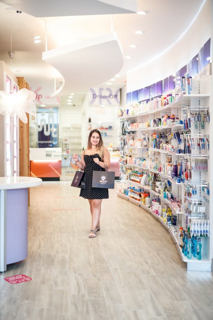
Why is that? First and foremost, curves tend to be more natural than straight lines and consequently provide a better scenario for accompanying the patient’s pedestrian flow within the pharmacy.
A curved line is the “line of space” by definition, since it can reduce or enlarge vision of things. Curves are flexible and natural, bound to nowhere. It recalls forms of nature and used to represent a sort of sea change from the strict classicism and the geometric rationalism.
Moreover, curves can give rise to a sort of neurological relief in the observer. A curved line is soft, captivating and surely appealing. These charming qualities are the ones retailers look for to make their premises outstanding.
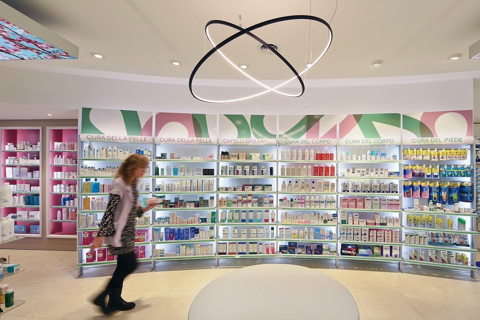
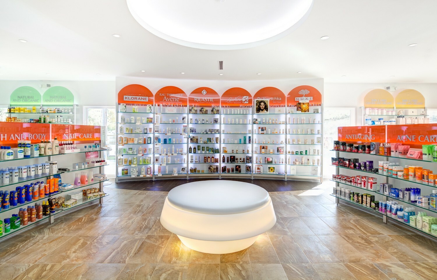
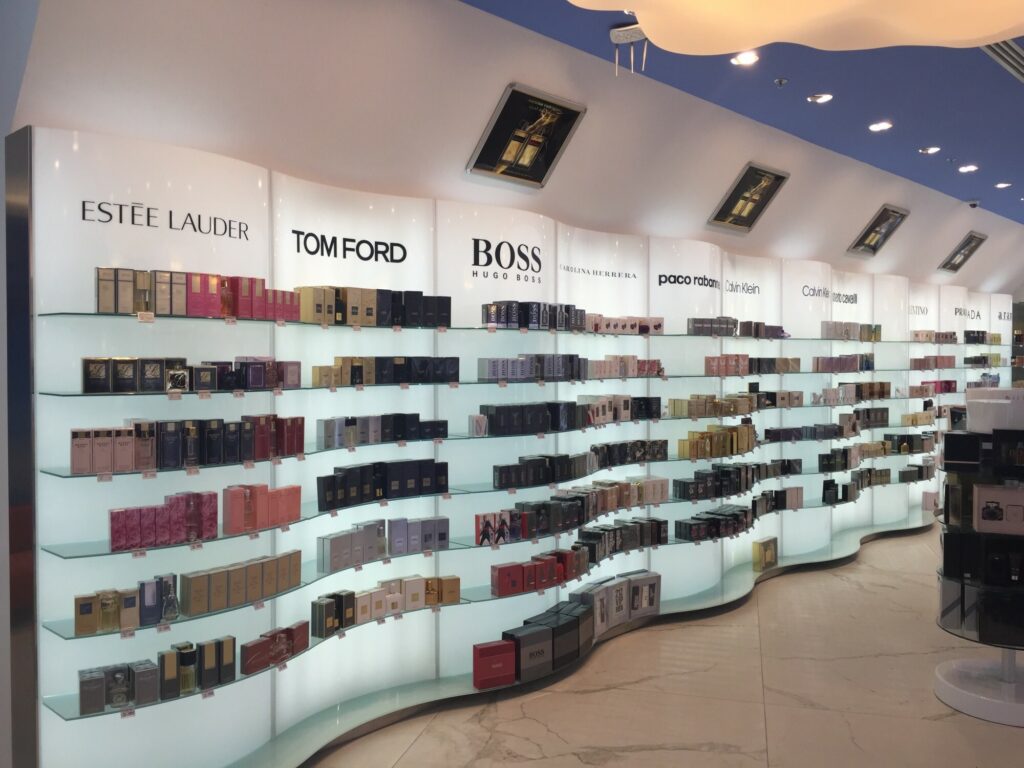
Clients are generally more willing to approach a curved wall or central stand units as opposed to straight ones. A curve welcomes and appeals on a subconscious level far more than a corner.
“This is because life is not made in a grid,” she said. “If you think of a natural landscape, it is not even and regular – but people go to these places and think it’s very natural, very relaxing. I think one can do that in architecture”.
(Zaha Hadid, Architect and Designer from Iraq recently passed away)
“I am not attracted to straight angles or to the straight line, hard and inflexible, created by man. I am attracted to free-flowing, sensual curves. The curves that I find in the mountains of my country, in the sinuousness of its rivers, in the waves of the ocean, and on the body of the beloved woman. Curves make up the entire universe, the curved universe of Einstein”.
(Oscar Niemeyer, Brazilian Architect icon of the 20th century)
But why should we do so in Pharmacy as well? The age of rack central stands is over for a while now. It happened when the product had not been on the forefront anymore since the patient and his needs occupied that space.
The retail design focus has progressively shifted from displaying clustered products to creating a positive experience for the client. Patients and their health and comfort became central. If you care about your clients, you win their loyalty throughout time.
The front-end area structured like a grid has never been so popular or appealing after all. It was certainly practical but very sterile as far as uniformity and relentless repetition of stands are concerned. It was never easy for clients to get oriented when such stands were way too high.
The idea of having a client shrouded in product offering is something which can be found in modern architecture since the curve gives not only a visual pleasure.
There may be a layout in which the curve is used to softly address clients towards several focal points such as the services offered or the pharmacy counter desk frontage. A curved line can be a round-shaped magnet to attract patients. Round-shaped retail furniture can be a winning point to furnish pharmacies in a healthy and natural way. How not to mention the trendy style of Chubby design? Market is slowly but surely going towards a slow-living concept, with comfy and rounded shapes. The attention more than ever is now on eco-sustainability and recyclability. This is the driving force behind waiting area design within pharmacies too. The pharmacy waiting areas become part of the retail pedestrian flow. They look easy and “experiential”, and can also be used to promote events.
Differentiation is at the base of retail business.
You must differentiate your brand to succeed in the market:))
This is why Sartoretto Verna integrates more and more its own new pharmacy vision with elements taken from Biophilic Design.
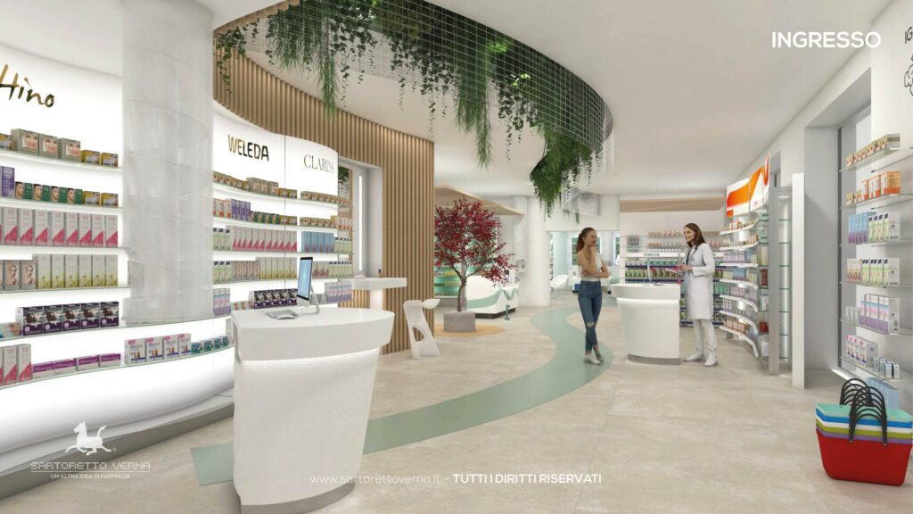
We insert within our pharmacy design plenty of green elements (with a considerable size too). They need NO maintenance and perfectly fit shapes and layout round outlines of our furniture. This is what hanging plants and big green settings stand for.
This new type of design is connected to nature and aims at improving our health, our mind and the ecosystem as a whole. Which are the findings we strive for? Our pharmacies are quality one and sell more* by winning clients’ loyalty.
* ask for our commercial data
Discover more: www.sartorettoverna.com
if you want to talk with us just reserve your call: