16 Oct Tell me which Pharmacy color you are after and I will tell you who you are!
Tell me which Pharmacy color you are after and I will tell you who you are!

Sartoretto Verna strives with its creativity for creating within your pharmacy some true sensory experiences happening even in accordance with an appropriate combination of colors. Colors can be related at times to the “genius loci” of the place hosting the premises. In other circumstances, colors reflect the pharmacist’s personality. And sometimes we are the ones demanded to express by colors our creativity. Our ceaseless study of either the market and the clients’ feedback is at the base of our expertise.
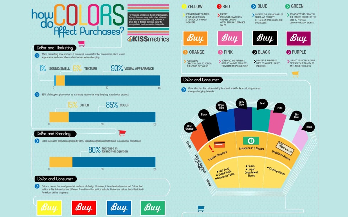
In accordance to some specific studies for example (i.e. Kissmetrics for online marketing) any client’s decision of purchasing a good is influenced at 85% by its color.
We are not talking about aesthetic solutions though. It is actually about the function of coloring for making a Pharmacy stand out and create a recognizable brand. This is a common principle for either an Independent Pharmacy, a Pharmacy Chain or an outpatient pharmaceutical premise within an Hospital.
Chances to be shortlisted and recognized by the consumer’s eye (which is more and more distracted) are increasing by proposing a color not in line with the products sector
(“Marketing loves colors” by Giovanni Scibilia)
Neuromarketing, a technique combining trading and science, was born with the aim of analyzing how your clients’ brain reacts when they are commercially stimulated. This is to better comprehend which message can be the right one to give rise to an impulse purchase. When we design or go for a restyling of Pharmacy, we bear in mind several useful factors to position the same within the market: analytical studies, our expertise and creativity must be remodeled in accordance to the Pharmacist’s taste.
Every single pharmacy is tailor-made. Every single color and material is studied. This is the major point making us different from any other competitor.
Our experience has coped with over 32 countries being different from each other in terms of habits and traditions. These diversities have been enhanced by choosing appropriate nuances of colors.
“By using the right color we can achieve two different emotional effects (Mehrabian-Russell model):
1) Pleasure (your patients will feel well & relax).
2) Arousal (your customers will desire and feel excitement)
In general, warm colors produce excitement, while cool colors cause peacefulness and relaxation….
…bright colors are usually perceived as attractive, while dull colors tend to be perceived as uncomfortable.”
(“Store design and visual merchandising” Ebster-Garaus)
Do you agree that each color is a vehicle to relax, excite or enlighten a pharmacy retail space which is presently "cold"?
This is a witty game. Please find enclosed a list of COLORS amongst the ones we frequently use. And there is a meaning for each nuance.
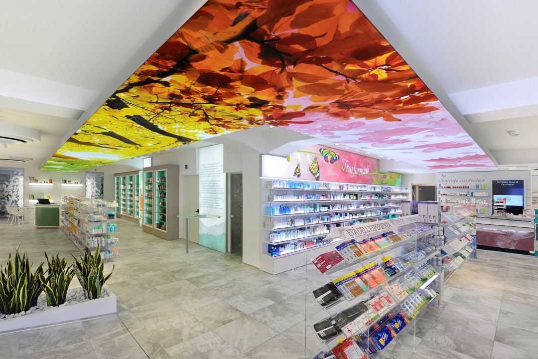
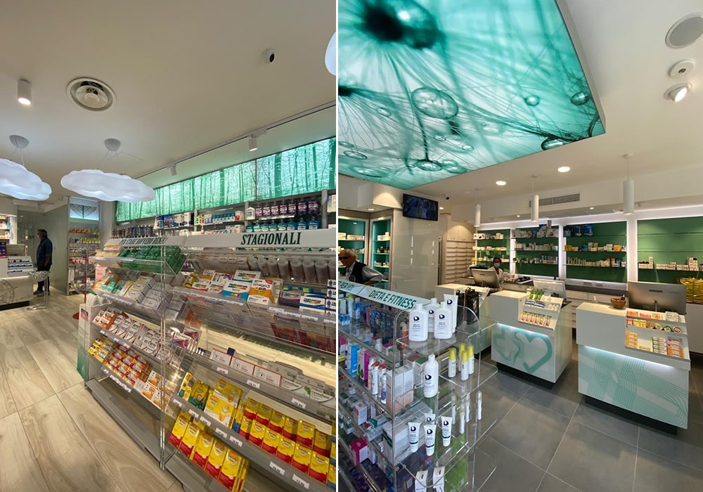
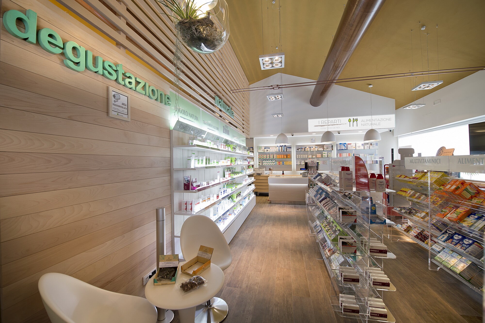
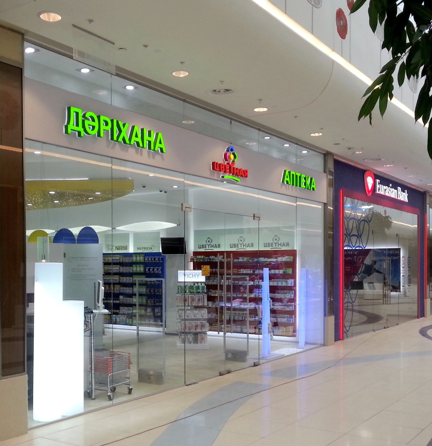
GREEN: green is nearly always a synonym of Pharmacy, health and nature. It is consequently the color which is used the most.
Green is easy to the eye and the mind. It is used in many different nuances. It is strongly advised when a pharmacy stands for an island of peace and health. It ingenerates in patients some fresh and stress-free sensations.
It is inserted (as the majority of “cold” colors) in small pharmacies to make the space wider.
Tiffany green has been used in many pharmacies also in conjunction with the Beauty and Skincare areas since it has been associated with the wealth recalled by the famous Brand.
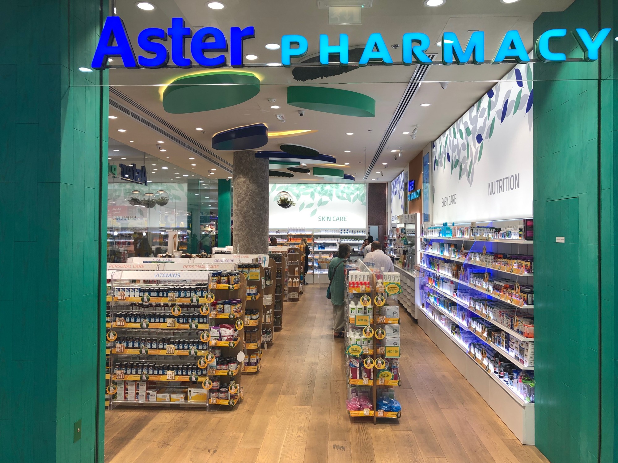
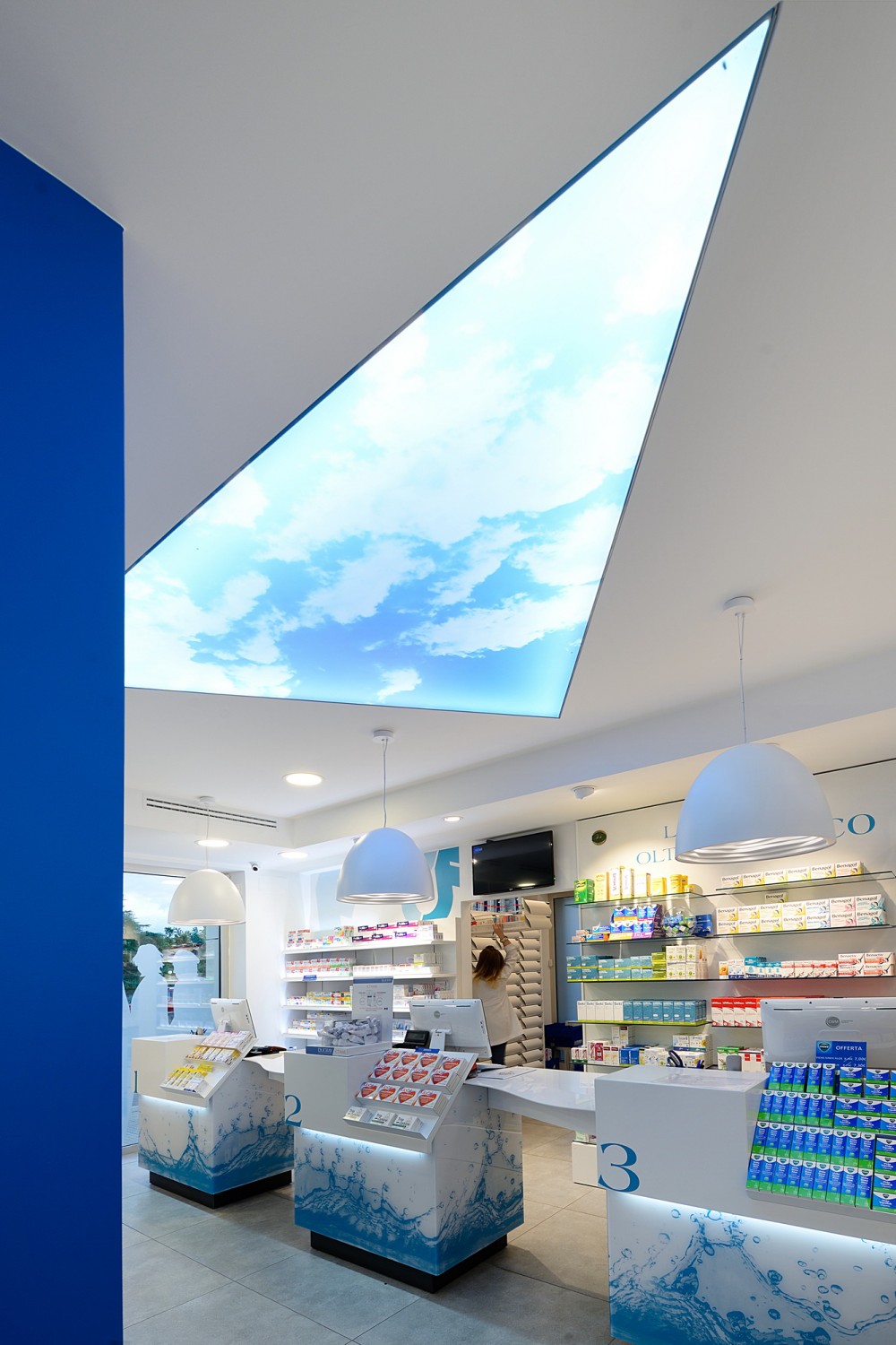
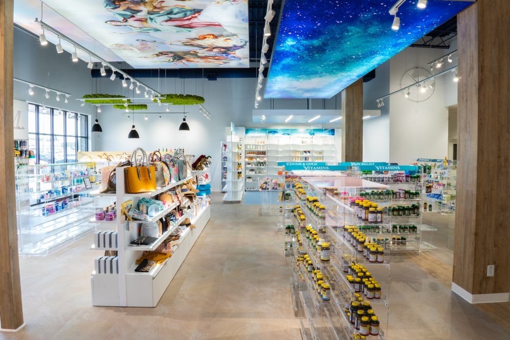
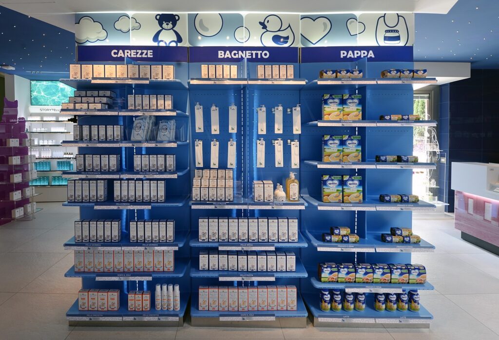
BLUE: blue is also very much used in many pharmacies and it is generally related to the hygiene sector which is behind the idea of water and hydration.
This color gives rise to quietness, comfort and relief. It is frequently found in pharmacy premises whose owner is a man, and especially in darker nuance evoking authority.
We are lately working with indigo shades (with panels cladded with flowers such as wisteria or hydrangea) either in the ethical area and the skincare one.
When we cope with island pharmacies or on the beachfront, often the sea is a leading theme to be taken inside the premises by natural and appealing shades.
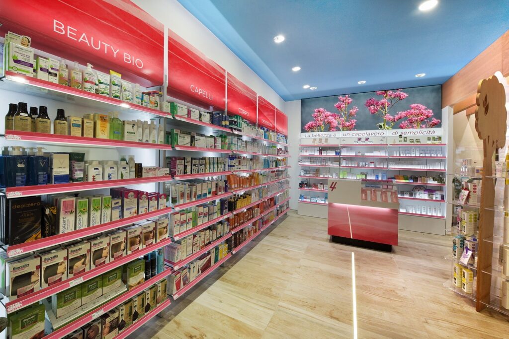
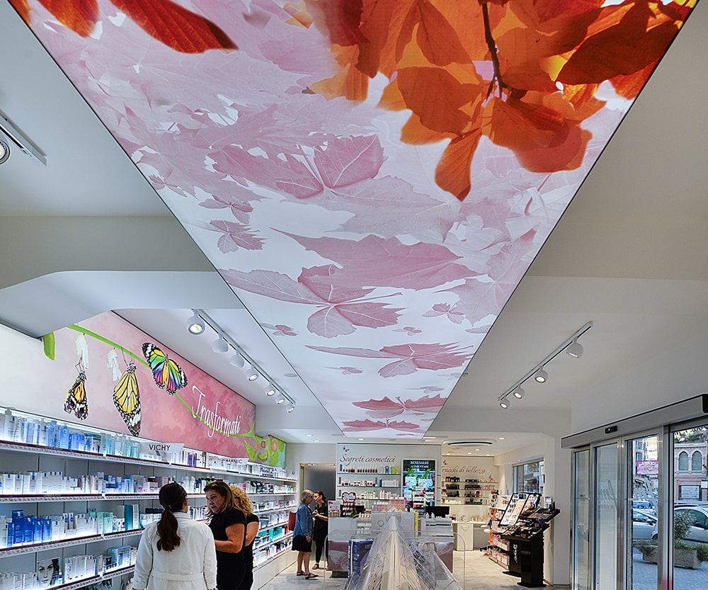
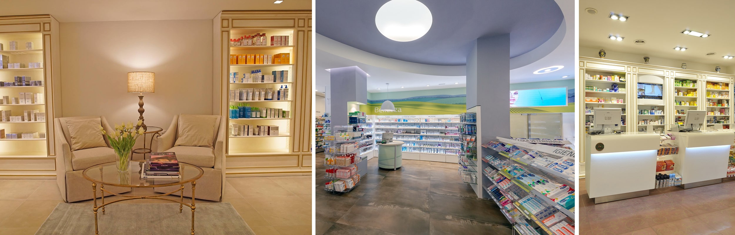
PINK SHADES: it is the feminine color par excellence. It expresses romance and appeals to the young ones. Pharmacies entirely pink-finished are very rare though. That being said, pink remains popular when we consider beauty, skincare, makeup and feminine products areas.
We have used pink in conjunction with flower images or abstract patterns, up to either the fuchsia more extreme or the passionate and vital red.
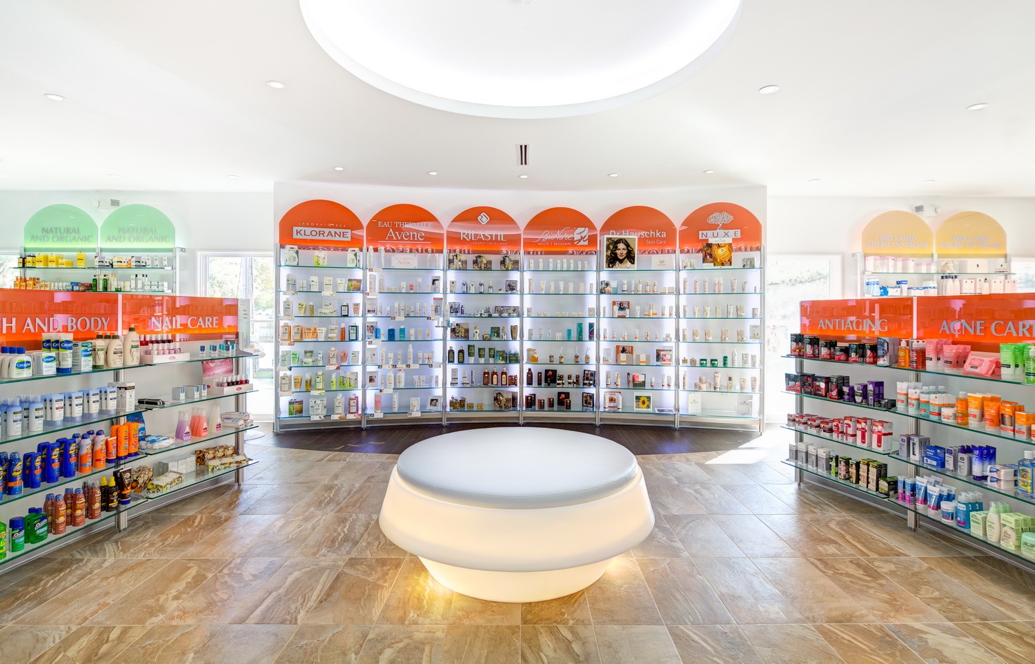
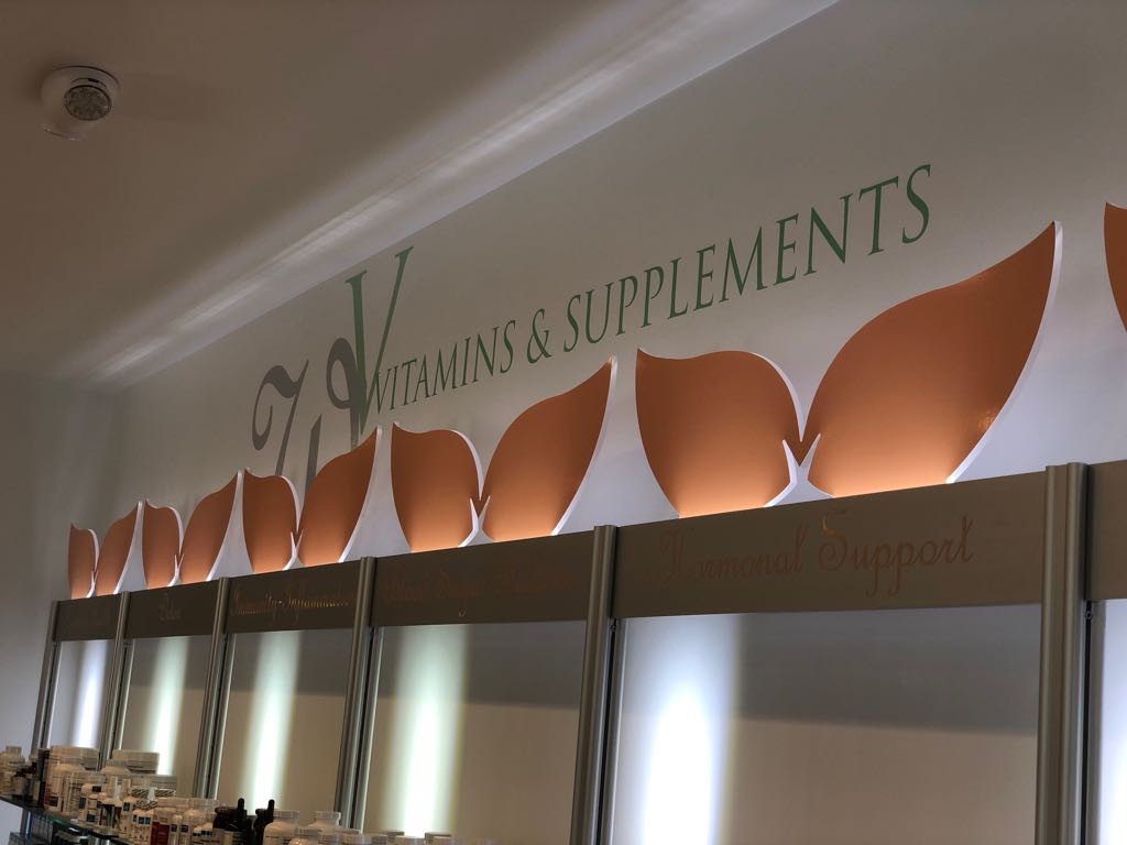
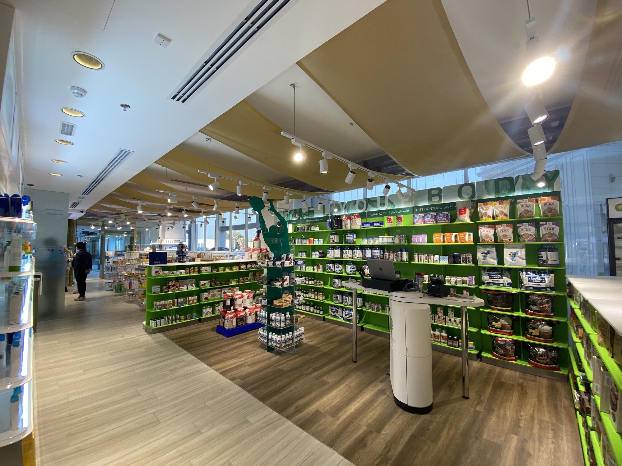
ORANGE / apricots: salmon-colored pharmacies recall energetic and positive feelings. The premises are usually located within areas where the sunshine is on and sweet fruits.
Orange is also the most used color for promotions areas, as well as supplements and vitamins ones. It can be combined with yellow within either gluten-free corners and special nutrition ones
Many sports supplement packages use this vibrant color. We love going for materials connected with terracotta, bricks naturalness and rather warm wooden shades.
Cladding an area with this color within a pharmacy will surely create some added energy.
I recommend this color especially for Pharmacies where patients are young, for vibrant Pharmacies.
NEUTRAL and pastel colors: balance, elegance. This is a more and more requested option whenever the pharmacy must look natural, eco-friendly and bio.
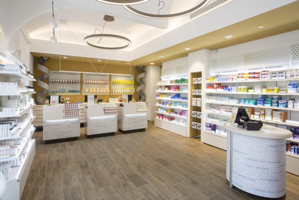
The colors connected with clay and terracotta shades recall tranquillity and simplicity. They make the pharmacist look more professional and away from commercial, retail policies mostly using aggressive and disturbing nuances with the only aim of offering promotions and discounts.
Pastel colors are the ones to create a pleasant environment, with a warm and comfortable perception which is leading patients towards calm and serenity.
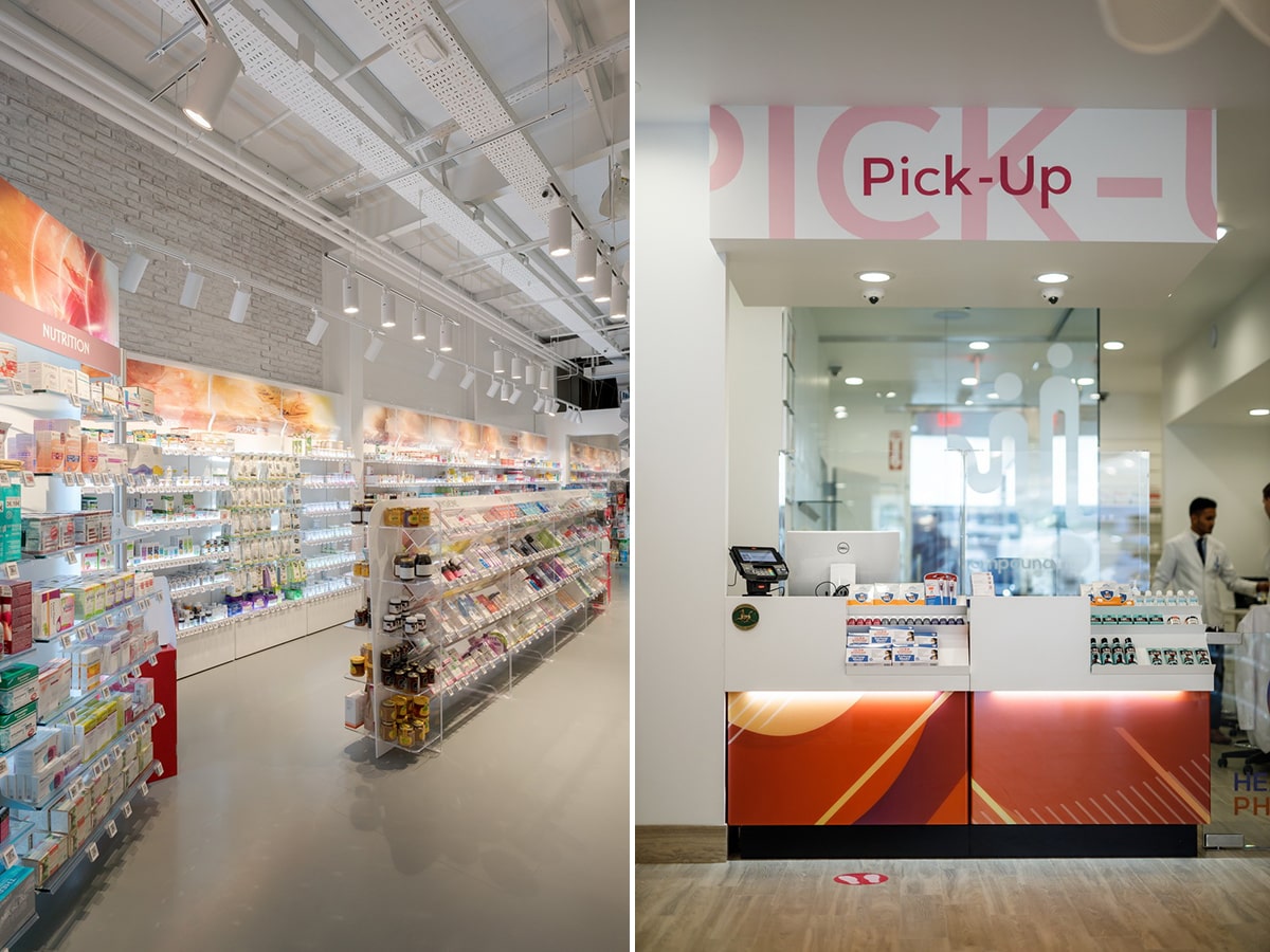
Total WHITE: luminosity and sophistication. One gets a Pharmacy with pure and positive feelings, maybe a bit cold at times and with evident maintenance issues.
A total white Pharmacy is focused on beauty and skincare treatments for body and face. The delicate image of the background can be easily finished with the vitality of products colors displayed on the forefront.
MONOCHROME: monochromatic pharmacies are often related with the brand’s color in order to create a market logo easy to be recognized and repeated.

We have realized pharmacies chains in which each category area was monochromatic with the aim of giving more strength and awareness throughout the purchase experience.
The pharmacy retail pathways are since ever connected to red-beauty,yellow-children, ethical-green and so on.
Colors are always used to influence customers' behaviours and make them perceive a positive experience within the premises. Discover our color fixtures to enhance your Pharmacy!
The commercial reward with correct commercial guidelines and specific fixtures are:
1) increase of sales,
2) brand recognizability and

3) customers loyalty.
Get in touch with us and your issues with gloomy lights will be just a distant memory.
Your pharmacy can look totally or partially different by just introducing the most appropriate color shades!…
CONTACT US => click here
or