


CONTACT US:
ROME – VIA TRIONFALE 13592
TEL: +39 06 9558 1450 r.a.
NEW YORK: +1 646 5699 091
email: info@sartorettoverna.com
MON – FRI: 9:00 Am – 18:00 Pm
20035 Jetton Rd, Cornelius, NC 28031, North Carolina USA
Dr Nicole Eastman turned out to be, from the very beginning of her interaction with Sartoretto Verna, very much willing to transfer her sophisticated, balanced and elegant mood into her brand-new pharmacy business.
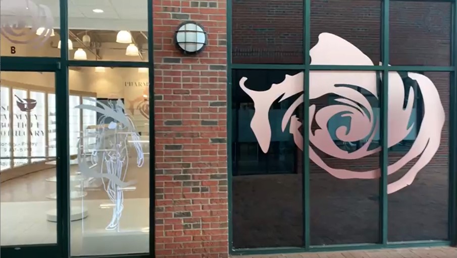
The location was presenting a good footage (1.560 sq ft) within a gallery mall with plenty of restaurants and retail places of a certain style. The building itself hosting the future pharmacy was finished with an interesting brick veneer cladding, which retained our attention. Our site survey also brought out a wooden finished floor of a certain value, as well as all the exposed HVAC pipes and retro-style lights hanging from steel trusses and girders.
Dr. Eastman had in mind to transfer in her pharmacy layout the very same concept she implemented in her own apartment. A balance of classy details and calm vibrancy. The tunes were also part of the game, as the bright colors seemed not to be part of the picture.
The premises were originally used as a gym and yoga place. The restroom was definitely too big for a pharmacy use, but in the end, it would have created more financial struggle to relocate the toilet elsewhere, especially with a view to introducing a pre-fab compounding sterile (usp 800 criteria) already shortlisted by the client.
The shell of the premises was definitely showing a certain appeal, and in line with the client’s taste and personal mood. The financial evaluations we did, in conjunction with the client’s budget, suggested that we concentrate mostly on adapting the new shortlisted Sartoretto Verna’s furniture to be creating a new project within an unchanged general layout.
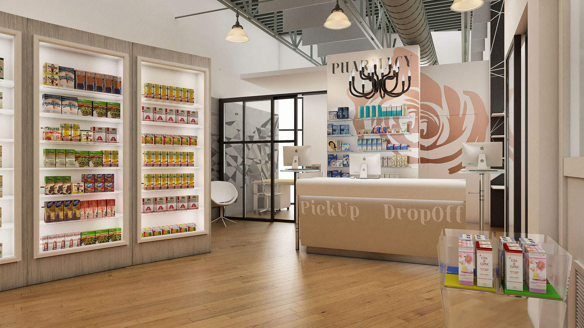
The rigid squared sequence of the super-imposed compounding area needed to be “softened” with a classy and involving retail area. For this very reason we chose to go for curving walls to be the support for “RAL6” wooden leaf frame stand units finished internally in white with vertical back LED lights. The dark brown brick veneer of the pharmacy front with black door and window profiles were “brightened” by Plexiglas round central stand (“Go Round” model) and orange shop window accessories (“Ralboo” and “Silhouex” model).
The central commercial line flanking many central stands in plexiglas (“Go-Plexi” model) pointed directly to the OTC wide counter desk (“Oliver” model) enriched by a precious hanging chandelier framing the back gigantic “Rose” Pharmacy Logo even more!
We did not forget the helpful consultation room aside, and now we do love the balance and classy combination of elements and are confident to be inspiring future-like pharmacy concepts!
CONTACT US:
ROME – VIA TRIONFALE 13592
TEL: +39 06 9558 1450 r.a.
NEW YORK: +1 646 5699 091
email: info@sartorettoverna.com
MON – FRI: 9:00 Am – 18:00 Pm